
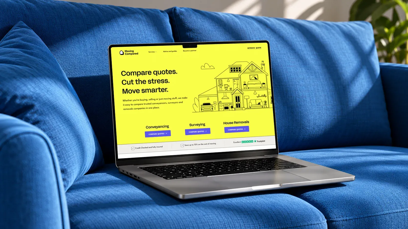
Designing a new brand and digital experience for home movers.
Moving home involves a lot of decisions. iPlace Global wanted Moving Compared to make one part easier: finding and comparing conveyancing, surveying and removals services. The platform needed a distinct identity alongside the company’s existing products, and quote journeys that made detailed questions feel manageable.
As Lead UI Designer at IMA, I worked from discovery through to soft launch with the client, the wider team and developers. I mapped the moving journey, reviewed competitors, planned the site and question flows, explored visual directions, and designed the final interface and reusable Figma system. A recurring decision was where to introduce related services: at the right moment they could help someone plan their move, but during a quote they could distract from the task.
The website is now publicly live with the core design retained. I later extended the system for a customer dashboard.
The challenge
Moving Compared had two linked challenges. Customers needed to provide enough detail to get useful quotes, but long forms could make that feel like hard work. The business also wanted to introduce related moving services without interrupting someone’s immediate task. I focused on making each step clear and choosing moments when another service would feel helpful.
Establishing the priorities
The project began with discovery workshops involving the client and the wider IMA team. I contributed to discussions around the business goals, intended audiences and the role Moving Compared could play throughout a home move.
Together, we explored user groups, brand principles, KPIs and future opportunities. These sessions helped establish priorities including mobile performance, accessibility, SEO and the ability to support additional services.
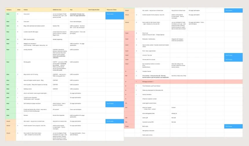
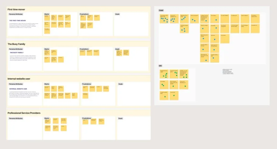
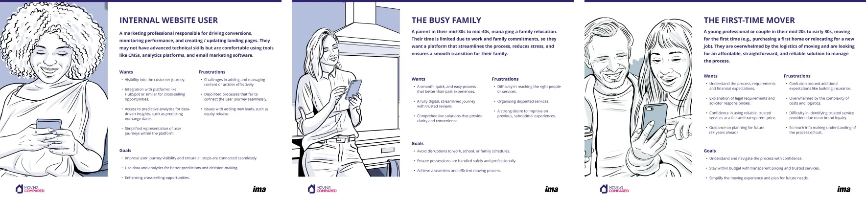
We also considered a range of audiences, from first-time movers and busy families to professional partners and internal users. Their different needs gave us a starting point for the journeys and functionality we would explore.
Learning from the market
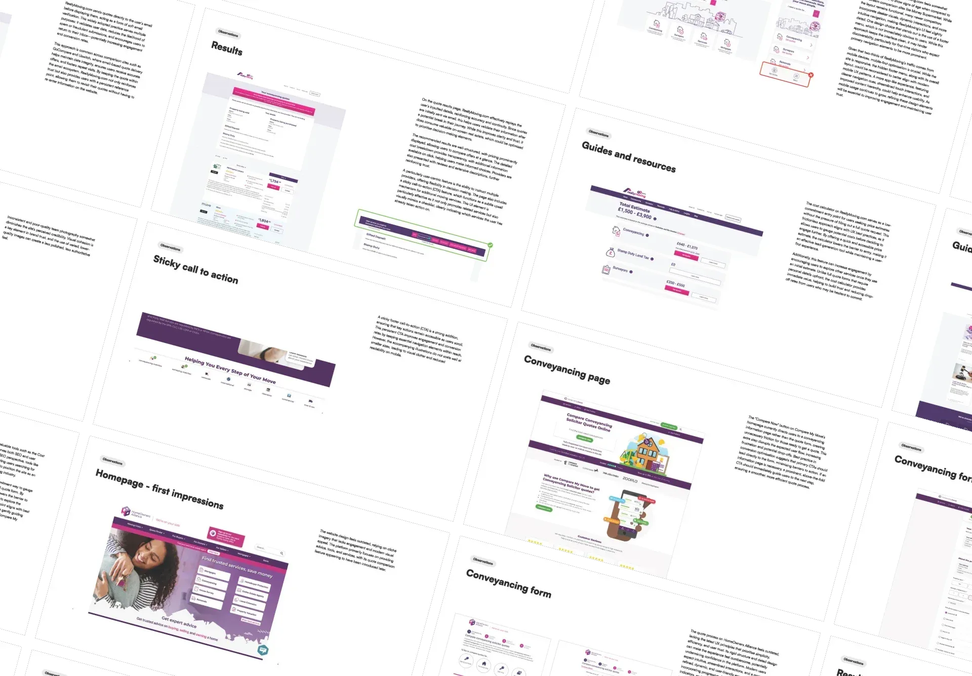
I reviewed competitors including ReallyMoving, Compare My Move and HomeOwners Alliance, alongside broader comparison platforms such as MoneySuperMarket.
The audit covered how each platform introduced its services, built trust and guided people through a quote. I looked closely at form patterns, results pages, pricing information, calculators and the placement of related services.
One recurring challenge was the amount of information customers had to provide. More considered experiences broke this into manageable steps, using address lookup, conditional questions and support at the point where it was needed.
I also examined how reviews, provider information and pricing transparency helped customers assess their options.
These findings informed the UX principles for Moving Compared, particularly around managing form complexity, presenting comparison results and introducing additional services.
Looking at the whole move
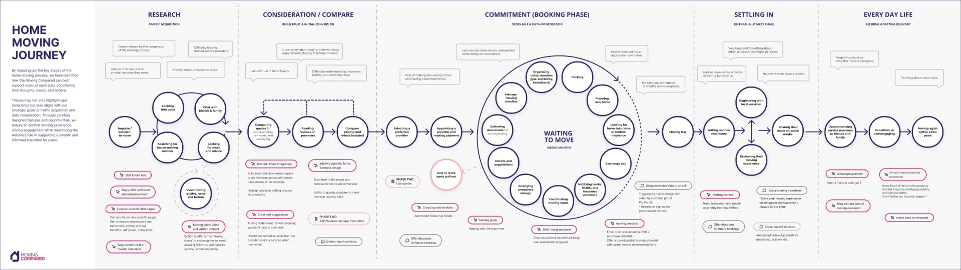
To understand where Moving Compared could be useful, we mapped the wider home-moving journey.
This covered initial research, comparing and booking services, preparing for the move, moving day and settling into a new home. Looking across these stages helped us identify moments where people might need practical guidance, reassurance or another service.
It also gave us a broader view of the product’s potential. Requesting a quote was one part of a longer journey, and there were opportunities to support customers beyond that first enquiry.
Finding the right moments for related services
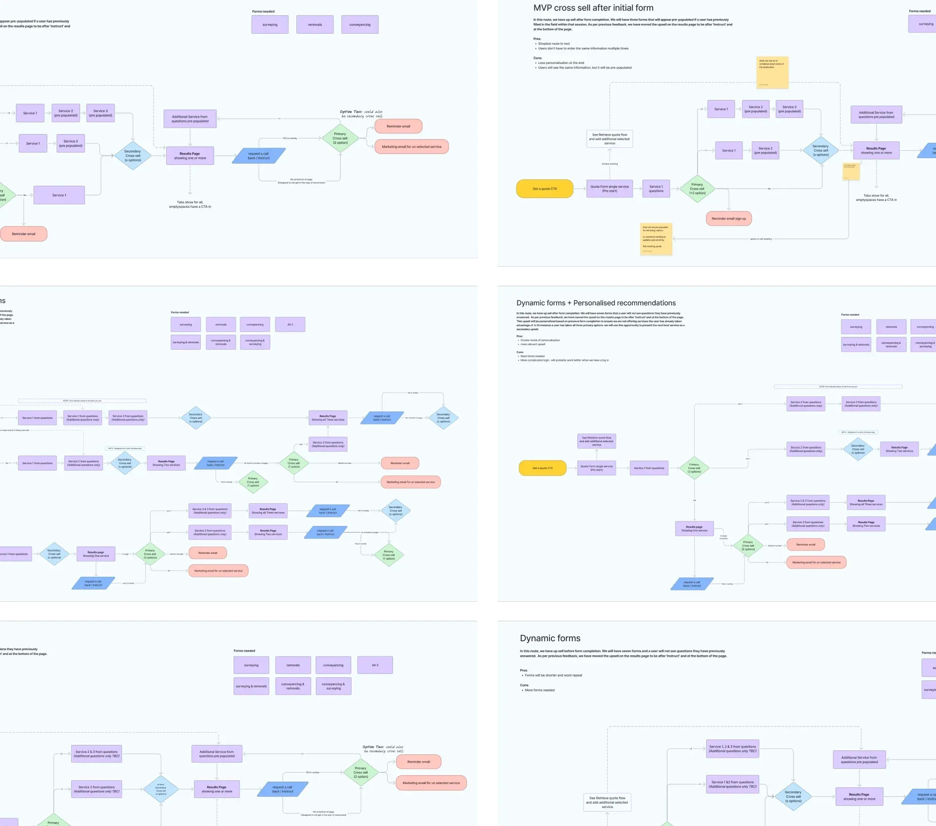
Encouraging customers to use more than one service was an important commercial goal. The design challenge was deciding where those recommendations would make sense.
I mapped several approaches: introducing related services before a quote journey, within the form, after an enquiry and through the customer account.
Each option involved a trade-off. Introducing another service early could help someone plan their move, but it could also add complexity while they were trying to complete a specific task.
Mapping the alternatives helped us discuss those trade-offs and consider how each approach would affect the overall experience.
Working through the structure and logic
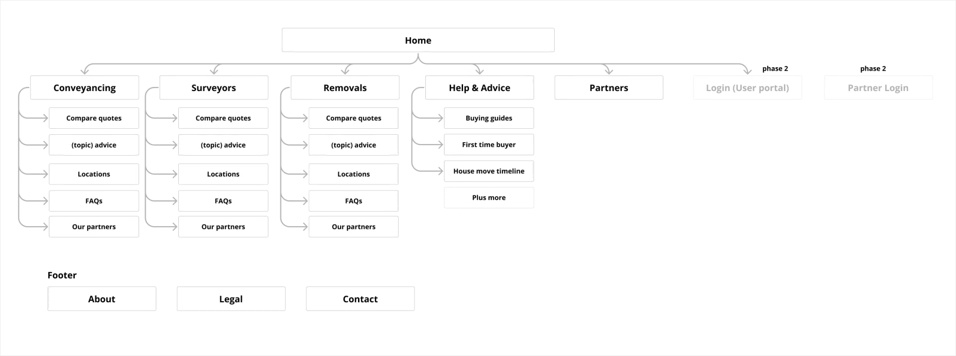
With the broader journeys in place, I explored how the platform should be organised. I developed sitemap options covering conveyancing, surveys and removals, alongside advice content, partner information and future account features.
Part of this work was separating what we needed for the initial launch from opportunities we could consider in phase two. Keeping those ideas visible helped us plan for the wider product while giving the first phase a clear scope.
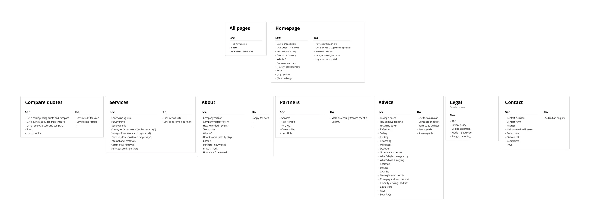
We then created a “see and do” map: a simple breakdown of what people would see on each page and what they should be able to do there. This helped connect the sitemap to the experience itself, outlining the content, functionality and actions each page needed to support before moving into layouts.
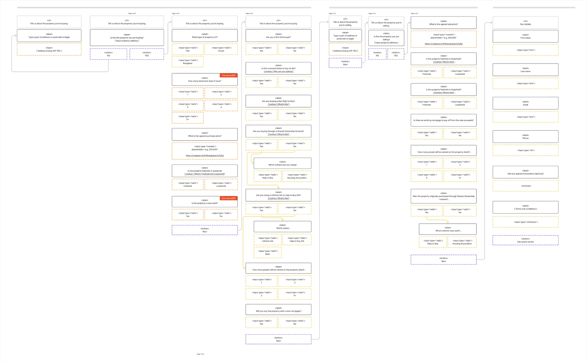
The next step was mapping all the information required to generate a quote for each service. This included the service needed, relevant property and location details, the customer’s circumstances and their contact information. Different answers could lead to different requirements, so the flows needed to account for those variations.
I explored a progressive disclosure approach, grouping questions into manageable stages and revealing additional questions as they became relevant. The aim was to make a detailed form easier to work through: customers could focus on a smaller set of questions at a time, with a journey that adapted to their answers.
The order of the questions was important. I worked through what we needed to establish first, which answers determined the next step and where more information would be required. For conveyancing, for example, whether someone was buying, selling or doing both would shape the property information we needed to collect.
The flows also incorporated the cross-sell and upsell strategy. I considered where related services or additional options could be introduced, using the customer’s answers to make those recommendations relevant and placing them carefully within the journey.
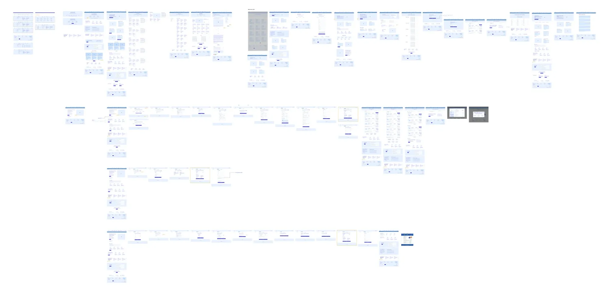
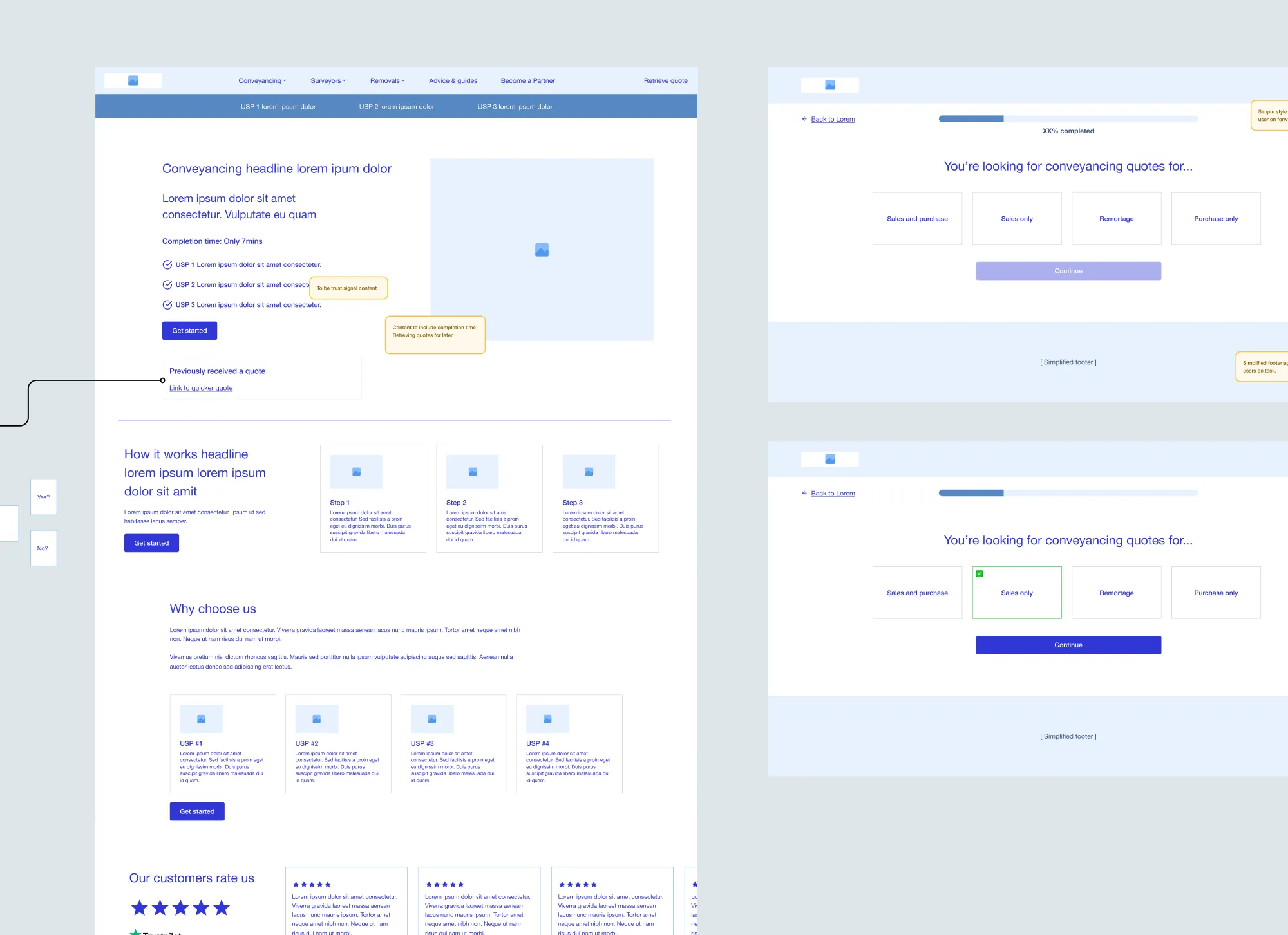
We then wireframed the full site, covering the content and functionality of each page alongside the individual service journeys. This gave us a holistic view of the experience, from arriving on a service page to completing a quote request and reviewing the results.
Seeing the pages and flows together allowed us to review how customers would move between them, where supporting information belonged and how shared patterns could work across different services. The wireframes brought the page plans and question logic into a form the team could review before we developed the final UI.
Finding a visual direction
Alongside the UX work, I explored how Moving Compared could look and feel. It already had an established brand, so the first step was to show how that identity could translate into a digital product and how far we could take it.
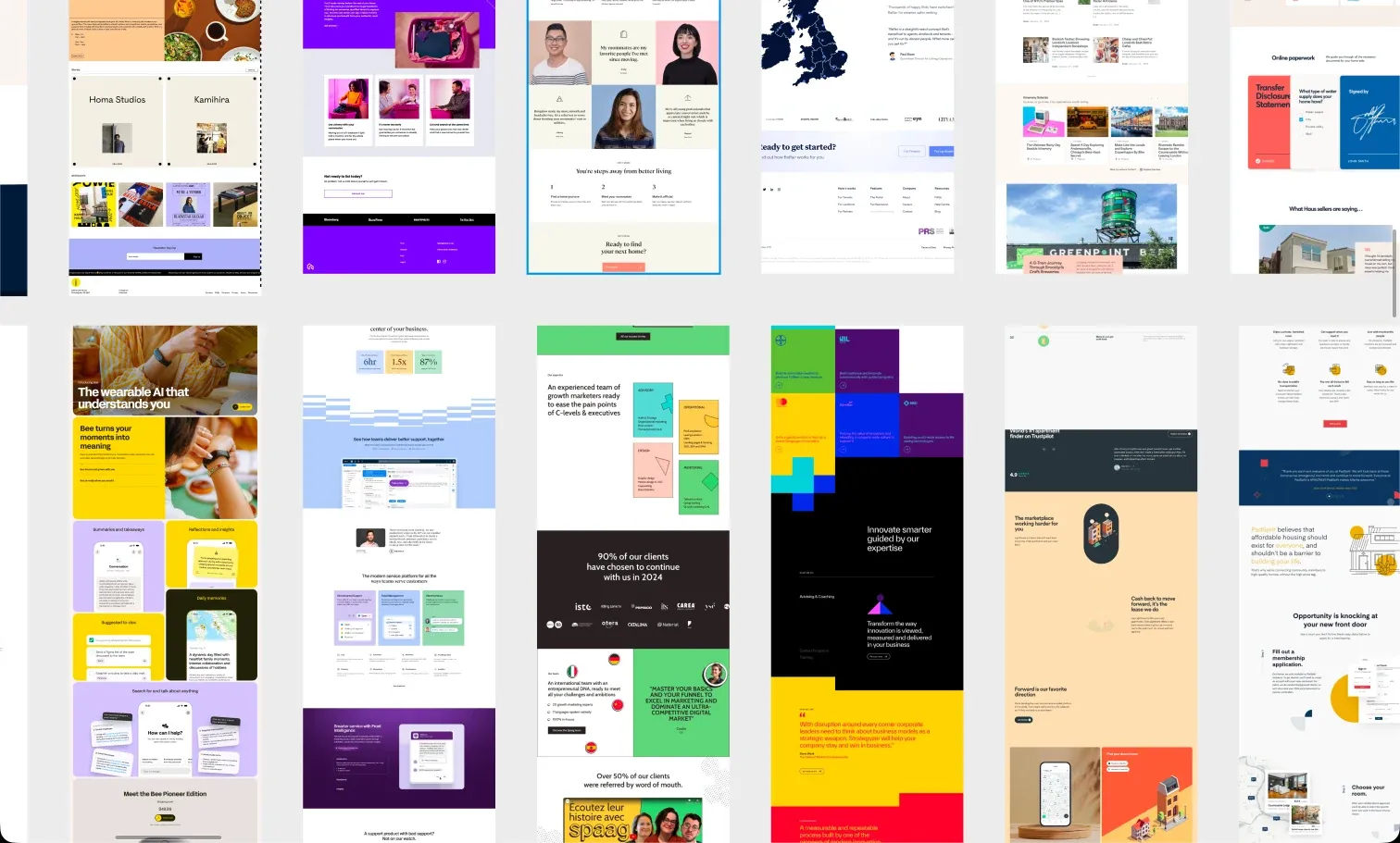
I gathered references from comparison platforms, fintech, editorial design and wider brand work, then developed four stylescapes.
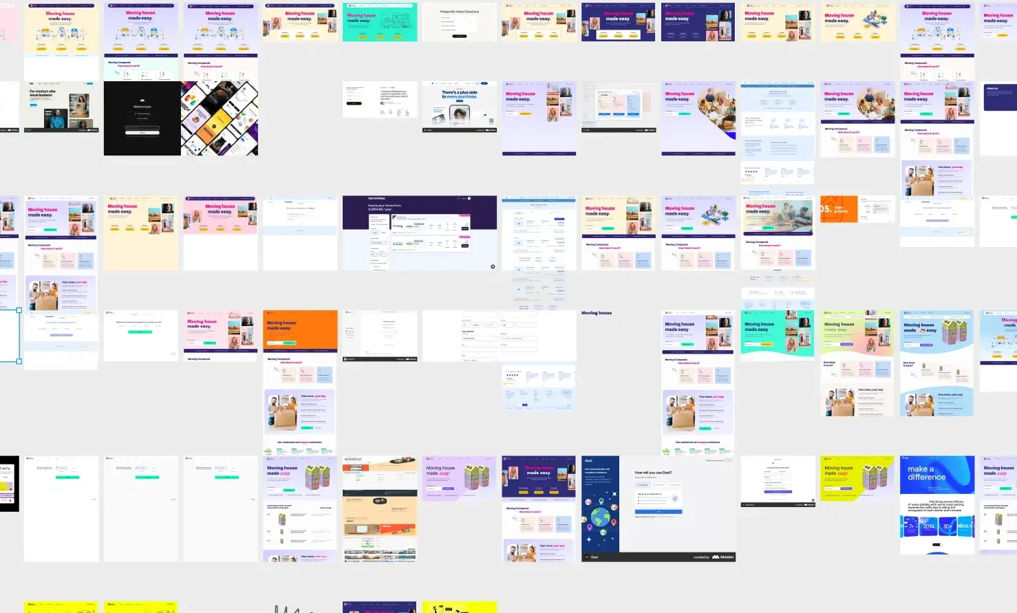
Option one visualised the existing brand, giving the client a familiar starting point. Options two and three pushed it further, exploring changes to colour, typography, imagery and layout.
Option four was the curveball. It introduced a completely different direction: a bold yellow palette, black typography, graphic outlines and a more direct visual style. Presenting the four routes together gave the client a clear range to respond to, from an application of the existing identity to a new creative direction.
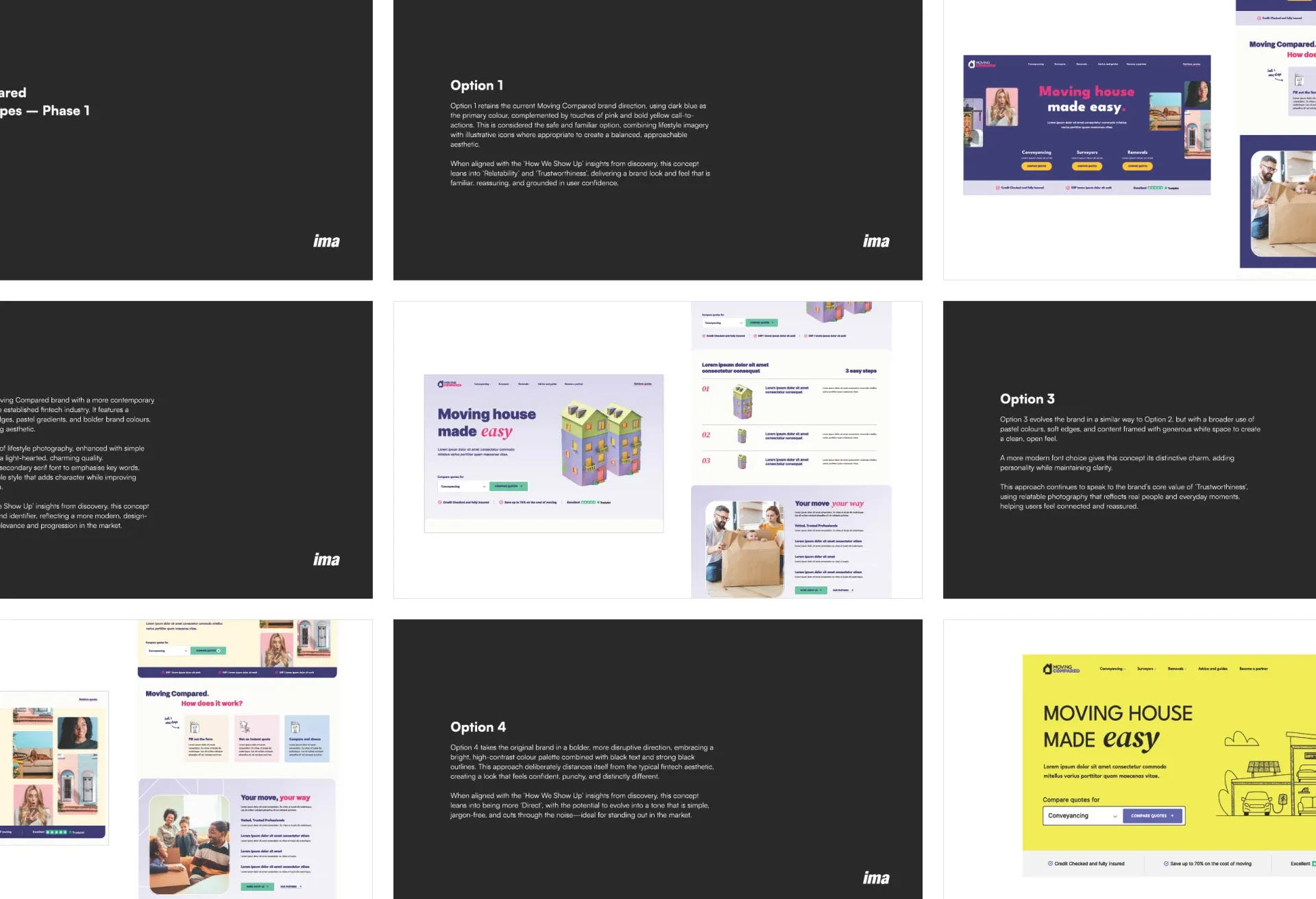
The client gravitated towards option four and could see its potential to give Moving Compared a distinctive presence in the market.
Following the presentation, I developed options two and four further, applying both to realistic product screens, including the homepage, quote forms and comparison pages. This helped us assess how each direction would work across the product, including the more functional parts of the experience.
The client ultimately selected option four. The yellow direction felt modern and recognisable, and gave us a clear foundation for developing the interface, illustration style and wider identity.
Giving illustration a clear role
Illustration became a central part of the chosen direction. The client wanted it to bring personality to the brand, and it needed to work across both prominent website moments and smaller interface elements.
I explored references from editorial illustration, architectural drawing and graphic systems before developing two complementary styles: larger hero illustrations for key pages, and smaller graphics and icons for use throughout the product.
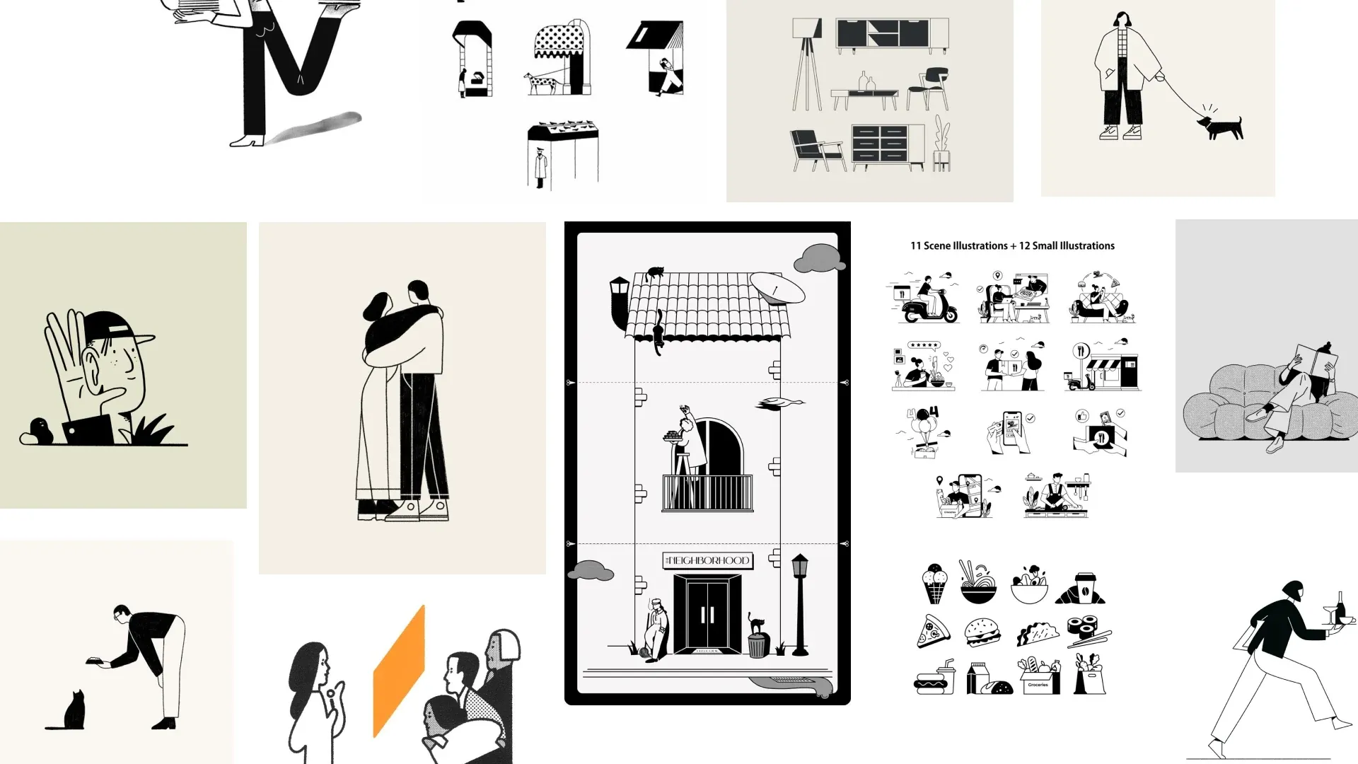
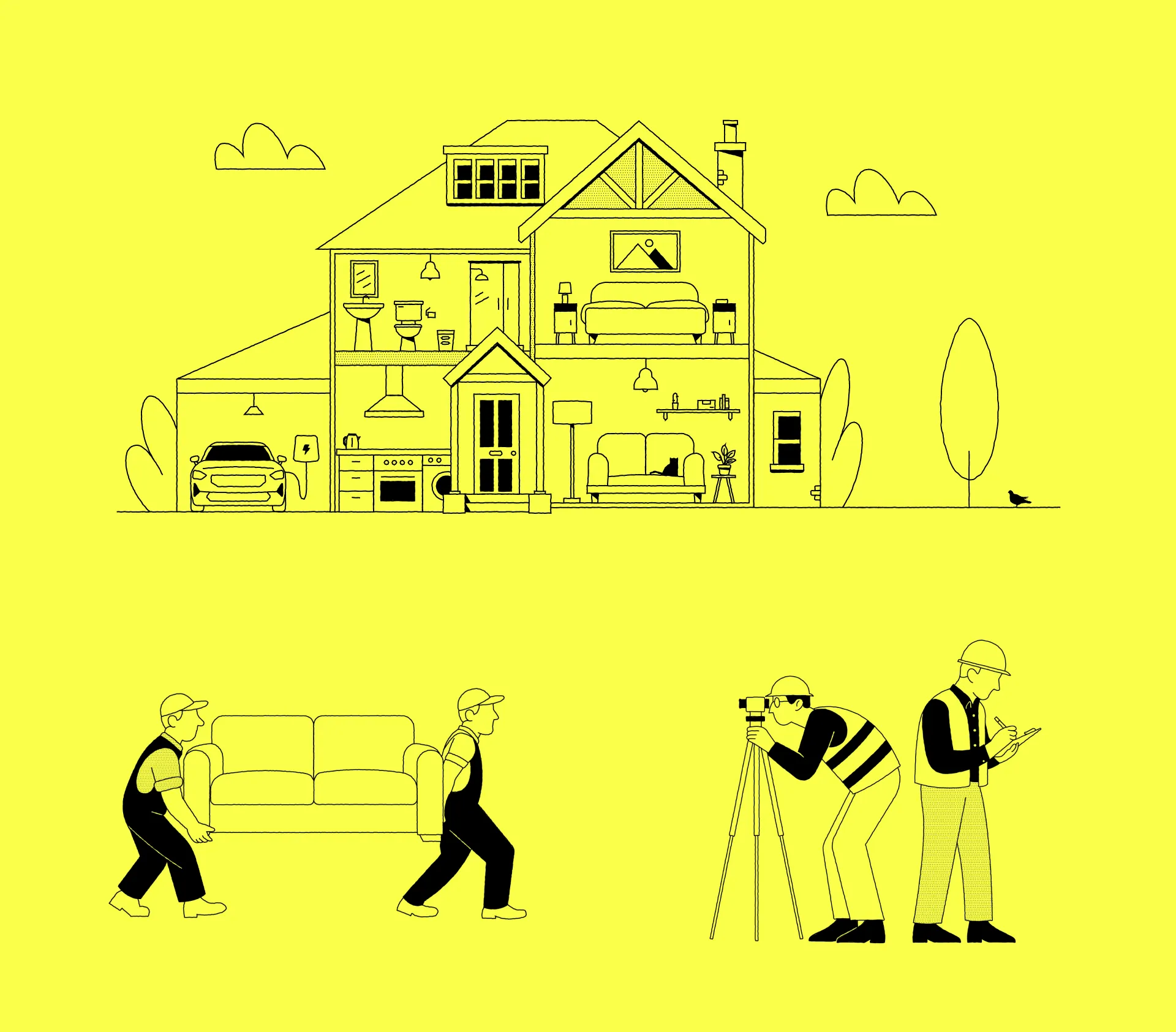
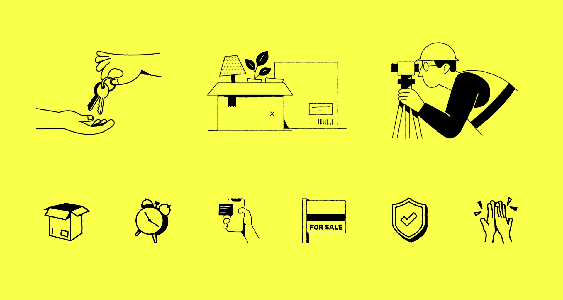
I also created illustration guidelines documenting the style and how it should be used across the site. These provided a reference for creating further illustrations and choosing the right type of asset for each context.
The guidelines helped make the approach repeatable, so new content and services could build on the same visual language as the platform grew.
Translating the direction into the product
Once the direction was agreed, I explored the key pages and journeys through rough layouts before developing the final UI.
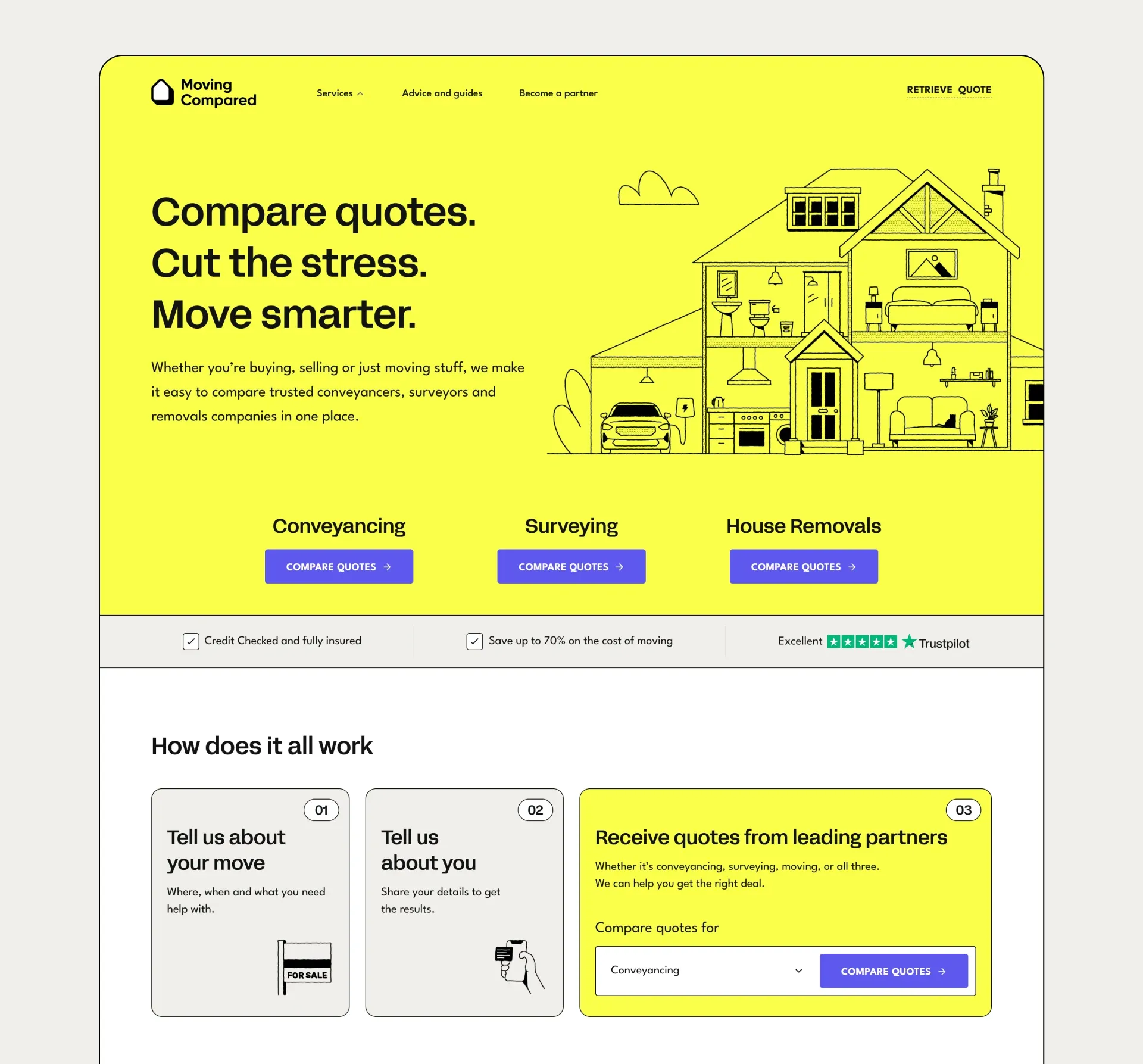
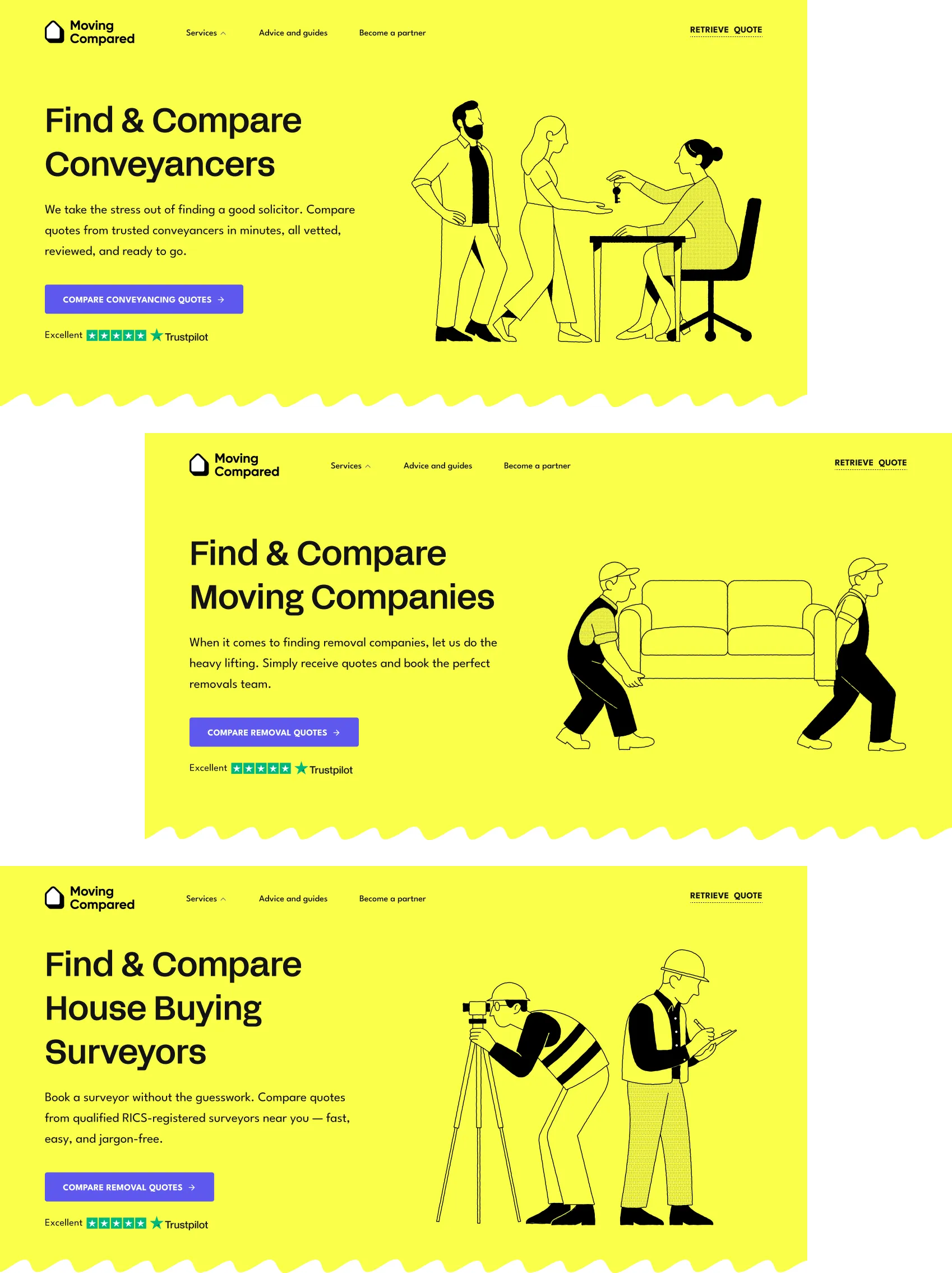
The design had to work across different types of content: marketing pages, detailed forms, comparison results and supporting tools. Each needed to feel part of the same product while serving a different purpose.
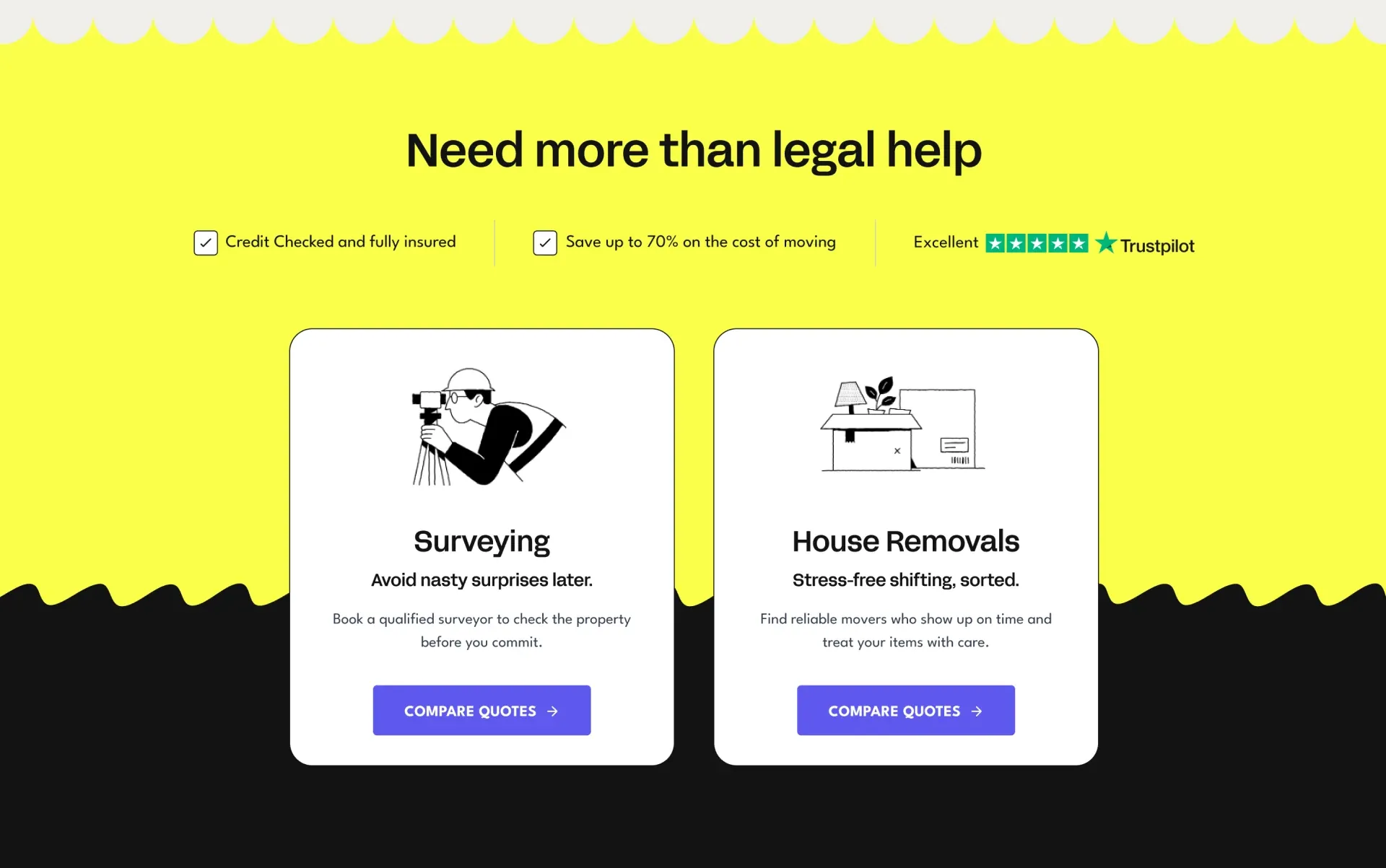
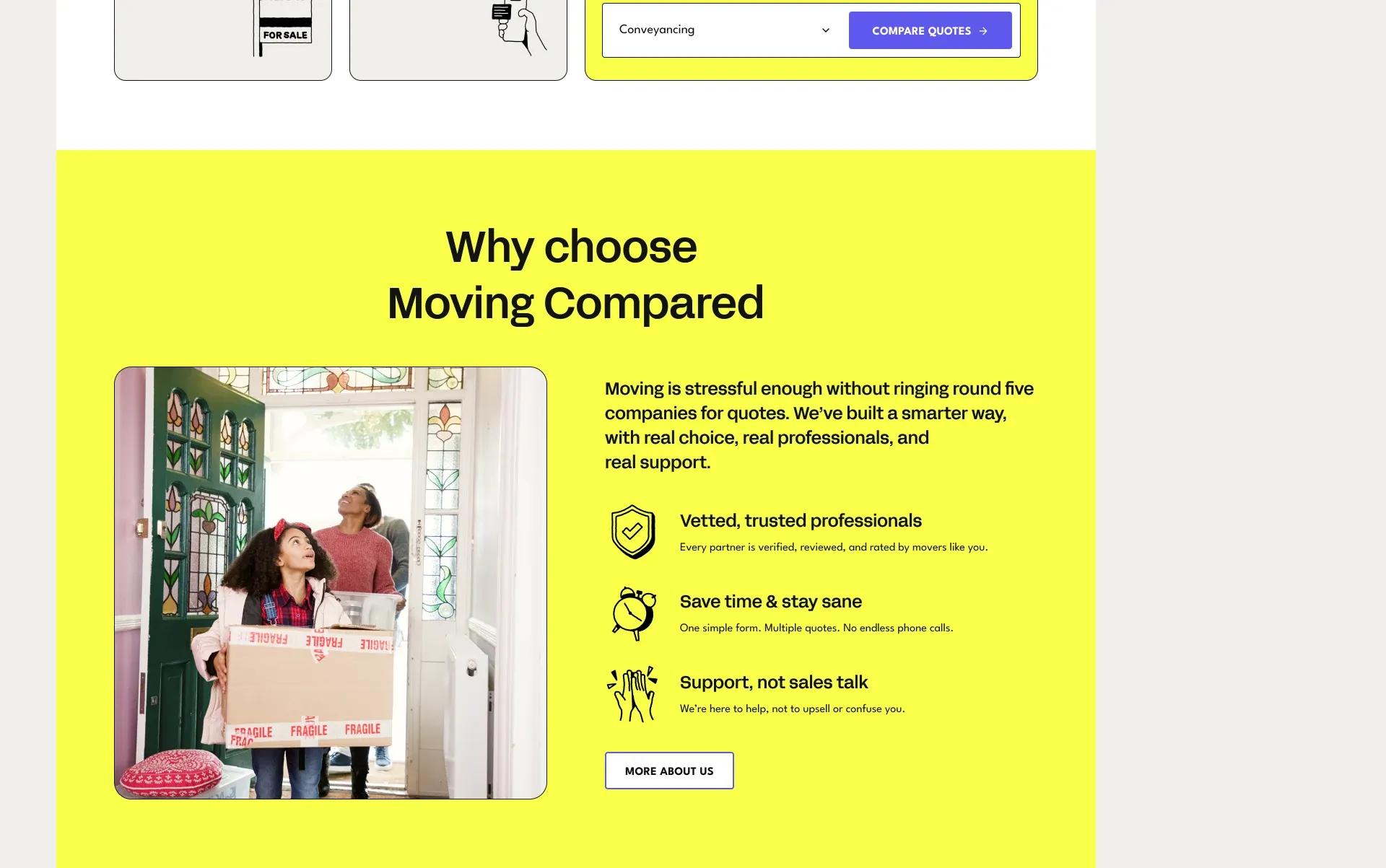
I used colour and illustration to bring character to the broader website, with simpler layouts and clear hierarchy in the quote journeys. The aim was to keep the brand recognisable while giving people space to focus on the task.
Making quote journeys easier to follow
Quote forms were one of the most important parts of the experience. Services such as conveyancing and removals require detailed information, so there was a limit to how much we could remove.
My focus was on how that information was requested.
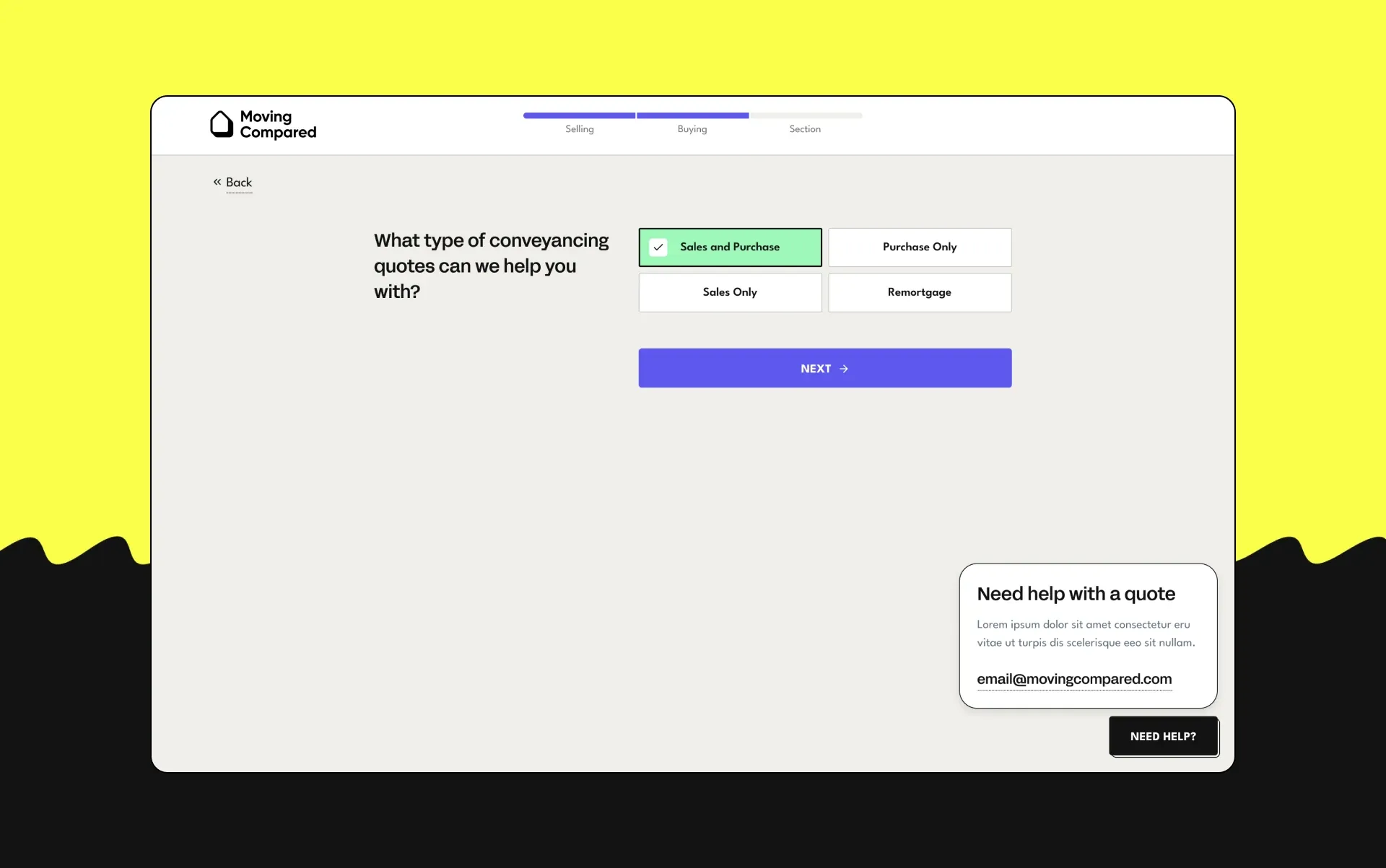
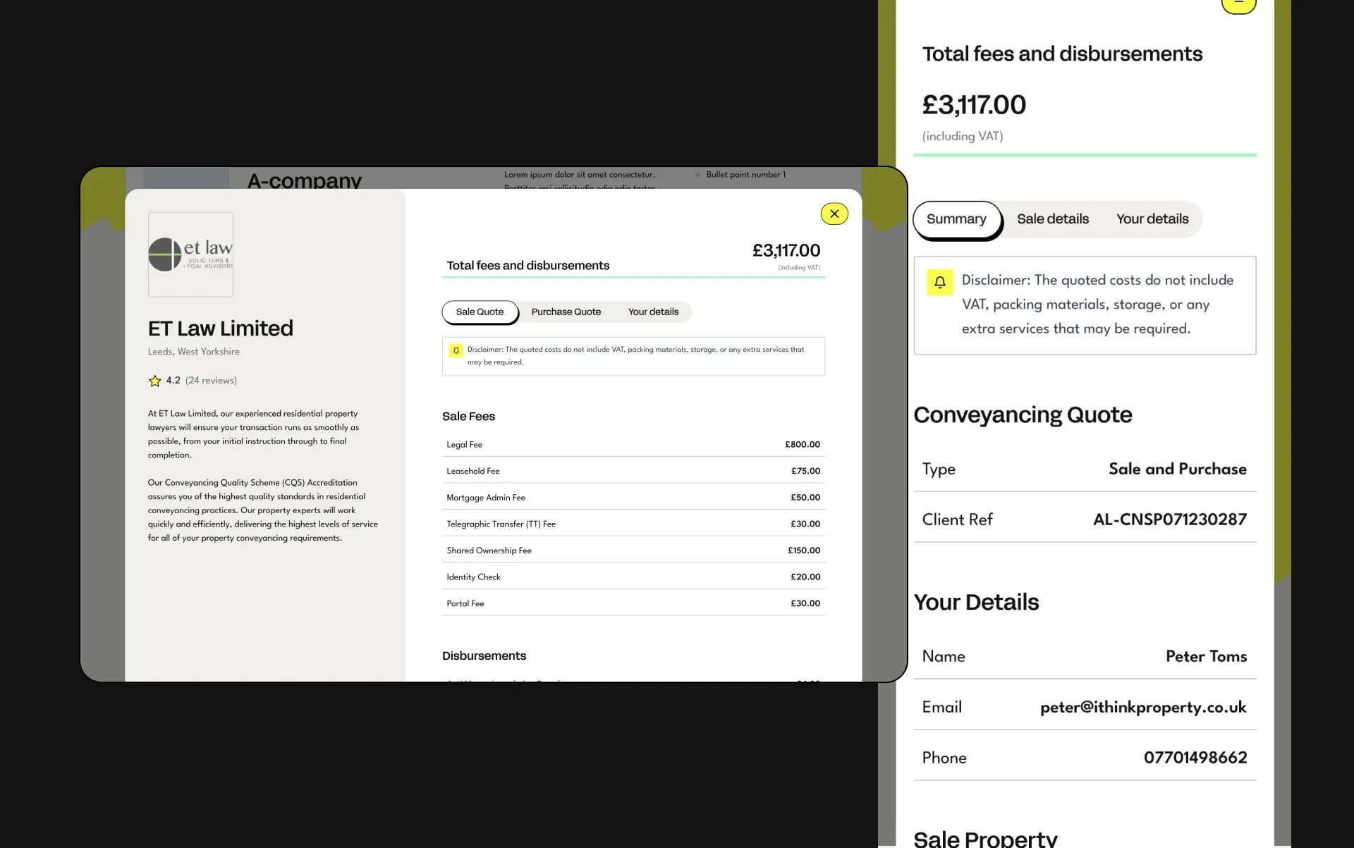
Drawing on the competitor audit and question-flow mapping, I broke questions into manageable stages and used conditional logic where appropriate. The interface was designed to make each step clear and help people understand what they needed to provide.
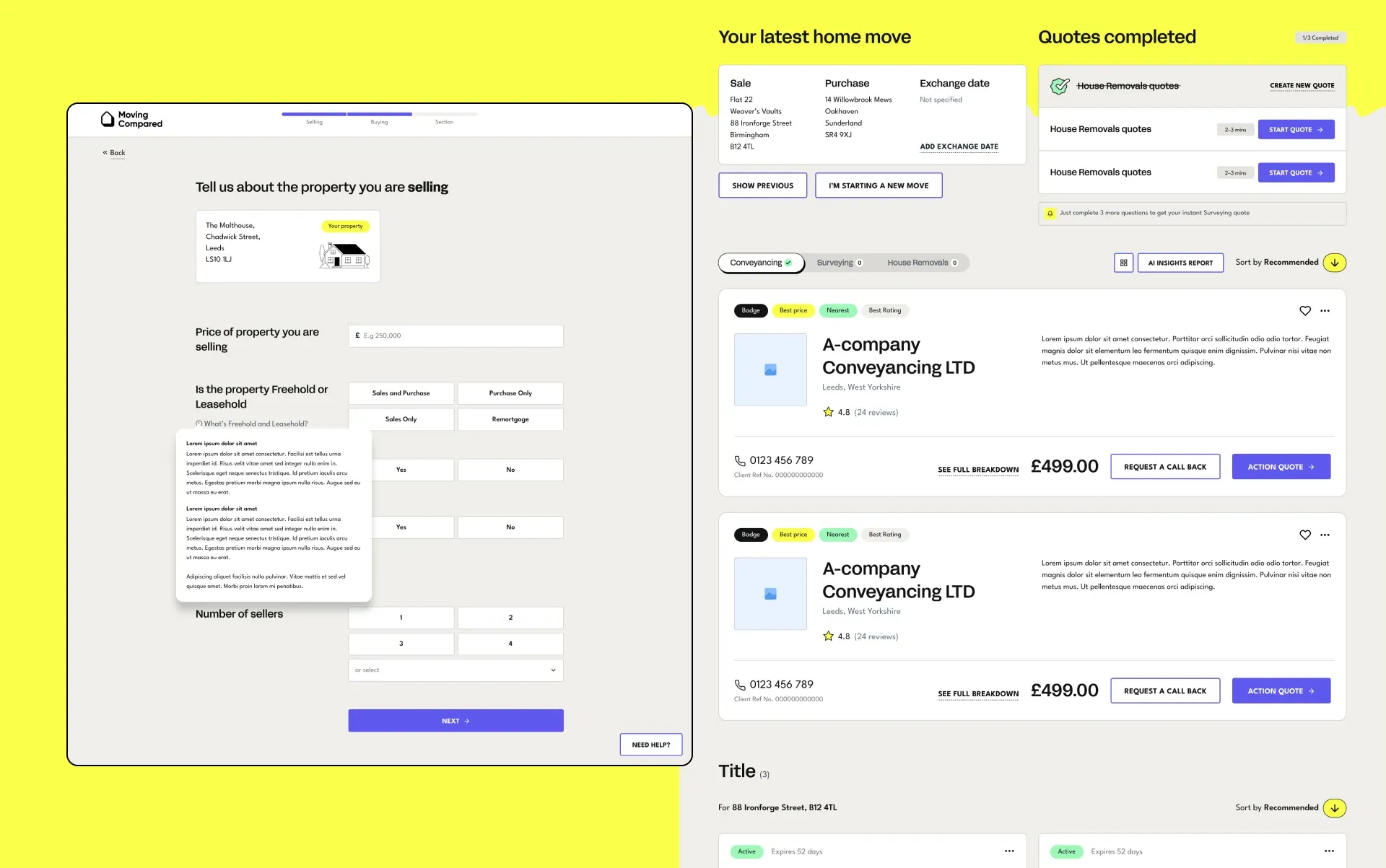
That approach continued into the results screens, where the hierarchy needed to help customers review providers, understand their options and identify the next step.
Creating a system the product could grow with
Alongside the final UI, I built a reusable design system in Figma using variables, component properties and atomic design principles.
It covered the foundations—colour, typography, spacing and form controls—as well as larger components for content pages, quote journeys and comparison results.
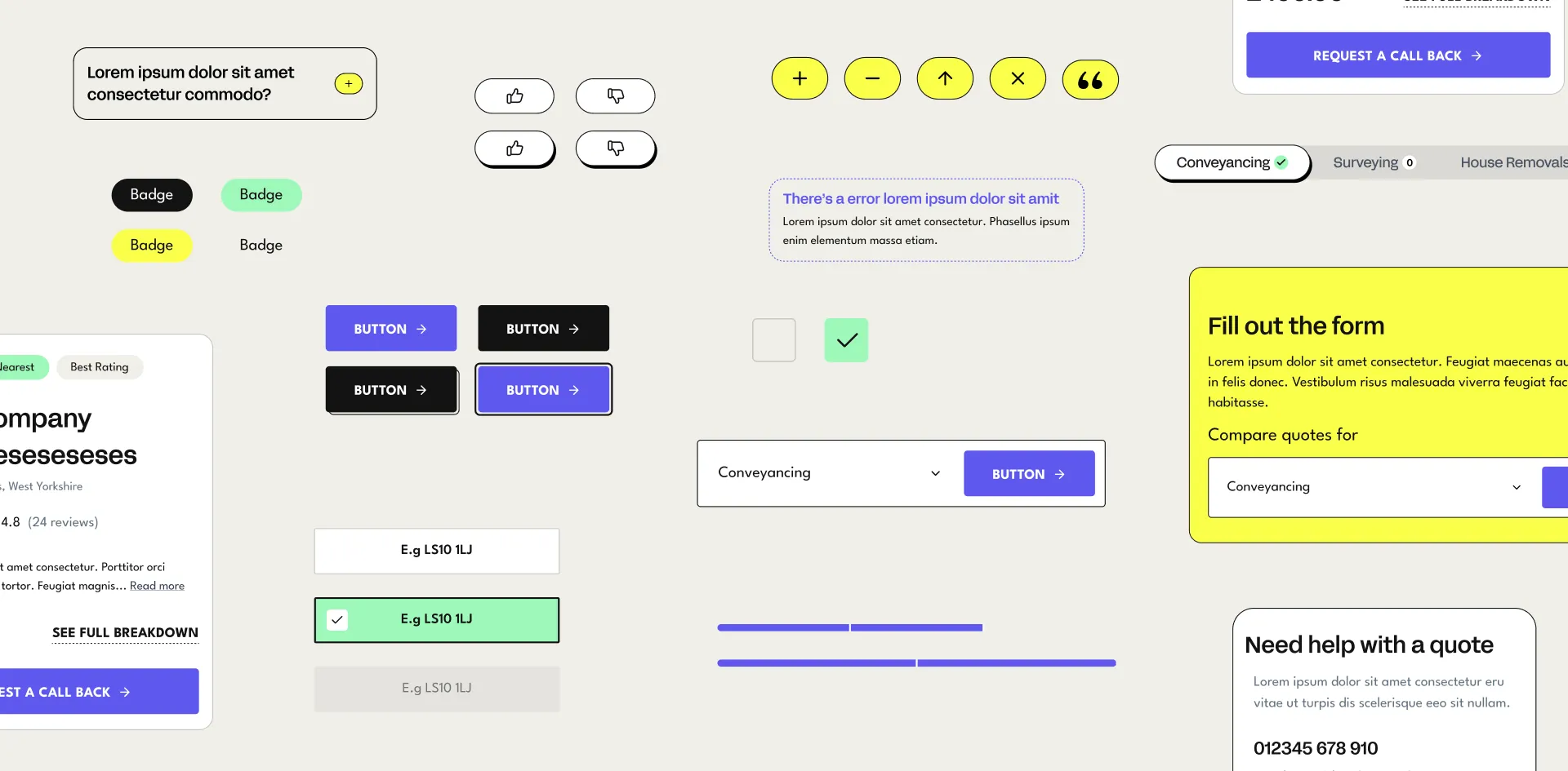
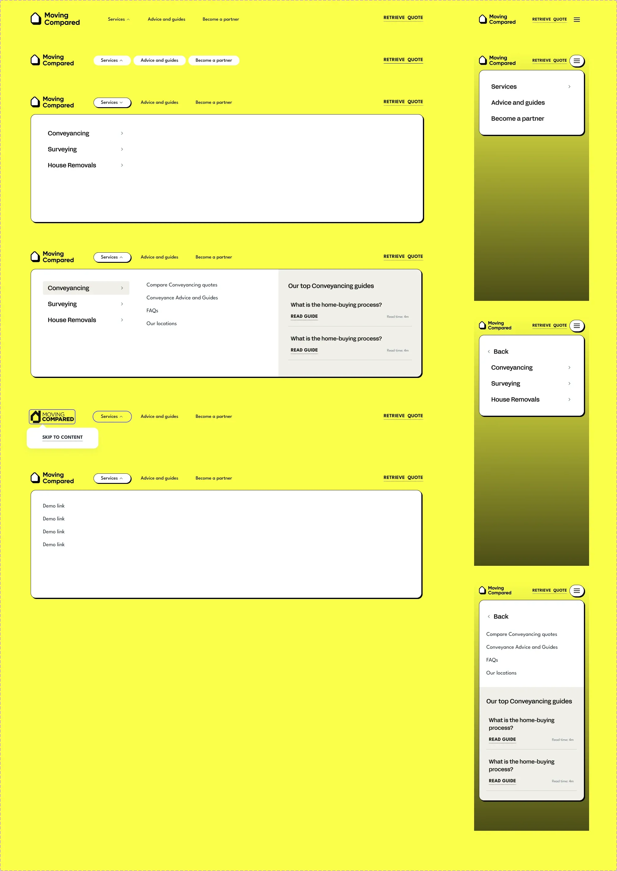
The system helped me maintain consistency across the product and respond to new requirements without rebuilding familiar patterns. It continued to evolve during development and became the foundation for the later dashboard work.
Supporting the build and soft launch
I worked closely with IMA’s development team throughout implementation, answering design questions, reviewing the build and carrying out design QA.
The site went through extensive testing across key pages, responsive breakpoints and quote journeys before its soft launch.
The wider rollout was later paused for business and shareholder-related reasons, so I don’t have meaningful post-launch performance data to report. The completed work included the new identity, website and reusable design system, with the main site taken through to soft launch.
Extending the experience into a customer dashboard
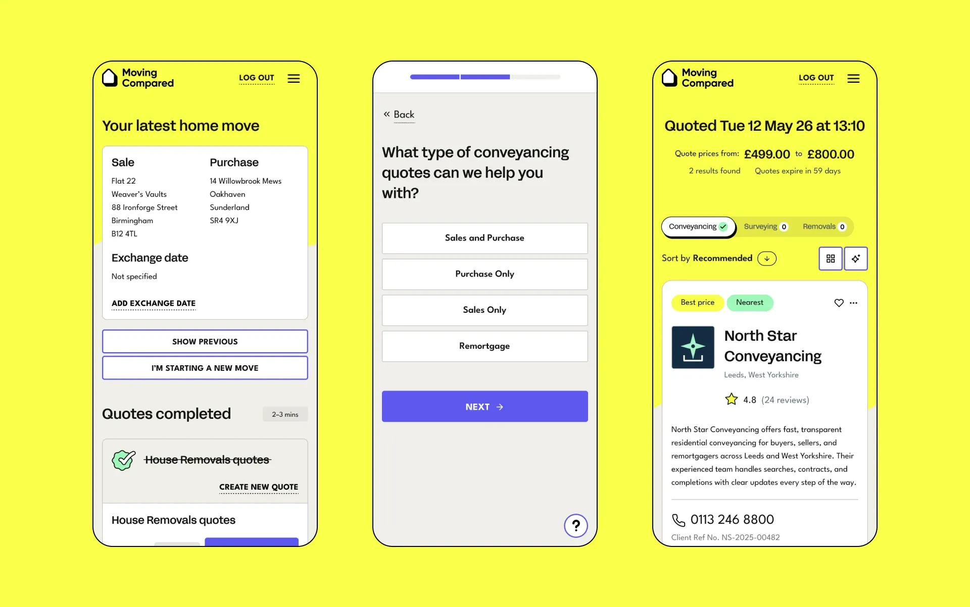
Following the main website project, I worked on a further phase focused on the customer dashboard.
The aim was to give returning customers a useful place to manage their move. I mapped journeys covering account verification, retrieving quotes, comparing providers, requesting callbacks and progressing to appointing a provider or making a payment.
I also explored features such as saved quotes, enquiry management, tailored content and recommendations for additional services.
After researching comparable dashboards and experiences in adjacent industries, I developed the user flows, wireframes and final UI. I reused the existing design system where possible and added new components where the dashboard required different patterns.
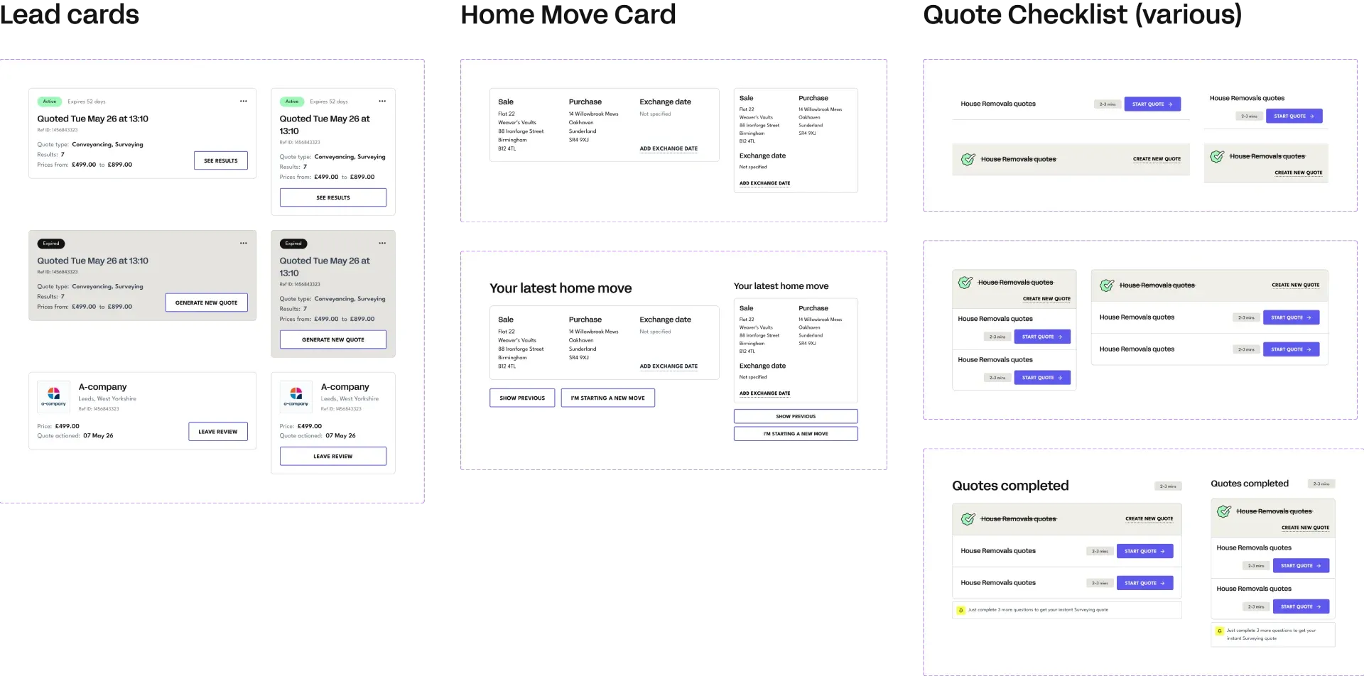
This extended the product while keeping the experience connected to the main website.
Bringing the identity together
Once the new visual direction had been developed, it became clear that the existing logo no longer felt right alongside it. Updating the identity became a follow-on piece of work.
The creative team began the logo exploration with my input. I then took the work through to completion, developing and finalising the logo to sit comfortably alongside the new typography, colour palette and illustration style.
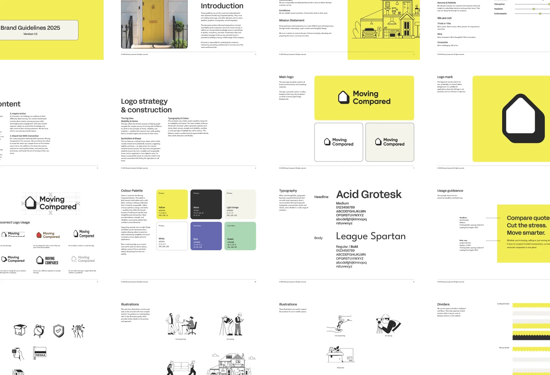
I also created a concise set of brand guidelines, bringing the identity together and documenting how its elements should be used consistently.
This gave Moving Compared a practical foundation for applying the refreshed brand across the website and future materials.
Bringing the work together
Moving Compared brought together brand and product design from the earliest stages of a new proposition.
My contribution ranged from mapping complex service journeys to developing the visual identity, building the UI system and supporting implementation. Decisions made during discovery and research carried through into the forms, comparison screens and later dashboard designs.
Across that work, my focus was consistent: give Moving Compared a clear identity and make a complicated process feel more manageable for the people using it.
Outcome
Moving Compared progressed from discovery through design, development and soft launch. The platform is now publicly live, retaining the core design I delivered across its brand identity, page layouts, illustrations and quote journeys.
My work also provided the foundation for the subsequent customer dashboard design phase, where I reused and extended the existing component system.
I don’t have access to post-launch analytics, so I can’t quantify its customer or commercial impact. The clear delivery outcome is a complete design taken into production and retained across the live platform.